Product
exping's Story: From Idea to App
tl;dr Hi👋 I’m Clu, the founder and product designer of exping, a custom map-marking tool. I’ve always wanted to take some time to write about how exping came to be and share the story behind it. With the release of version 1.1, I thought it was the time to write down the journey of exping.
Hi👋 I’m Clu, the founder and product designer of exping, a custom map-marking tool.
I’ve always wanted to take some time to write about how exping came to be and share the story behind it. Previously, I only briefly mentioned it on the Anyway.FM podcast.
With the release of version 1.1, I thought it was the time to write down the journey of exping, from its idea to the building of our team, and finally, to its launch.
How It All Started
The idea for exping began many years ago, around 2014 to 2016. Back then, I often marked coffee shops I visited on the map and shared them on social media. I would check in, review the machine they used, their coffee, and recommend specific drinks.
Over time, friends started asking for my coffee shop recommendations when they traveled. As a freelancer working from various coffee shops, I cared about finding good places to work and wanted to share that curation.
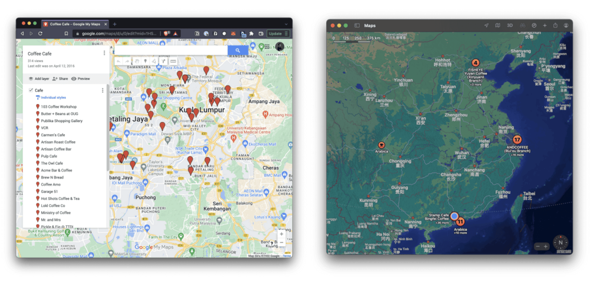
Back then, I mainly used Google Maps' My Map to mark locations.
One day, a stranger reached out and asked, "Can I buy your coffee map? I want to explore each shop you've visited." When he actually paid for my map, I realized that people valued and were willing to pay for my curated choices.
This was different from businesses paying me to review their shops; it was about fans trusting my selection of places and experiences.
Although this idea stayed in my mind, I didn't immediately turn it into a product or service.
When the Pandemic Hit, Life Went On
In 2020, the COVID-19 hit unexpectedly, causing a significant drop in income for many of my Malaysian friends. However, life went on, and expenses remained the same. Although people went out less, they still had memories of places they had visited.
I wondered if these past experiences could become a new side income during the pandemic. People could mark places they had explored, share experience from their local outings, nearby excursions, to even outbound travel — whether it’s hidden gems or places to avoid, anything related to locations can be marked on a map. Anyone who trusted their taste could pay for these curated maps.
While knowledge-based paid content was popular in China, I found no such product in Southeast Asia, where I was familiar. So, I began incubating "exping" within the company.
The reason why it is called 'exping' is to encourage everyone to explore, experience, and to build connections between these locations and people.
Exploring, Expriencing, Ping (which programmers should all know).
And the domain .world is intended to inspire everyone to exping the world.

Bringing the Idea to Life
With a clear vision of the product's prototype in mind, it was time to assemble a team.
I pitched the idea internally within the company, seeking out capable individuals who shared the same vision. Fortunately, there was already a Flutter research team in the company who saw the value in the product. Alongside a product manager and designer, our team quickly came together.
We started with just five members, keeping costs manageable. The Flutter cross-platform framework was advantageous for our small team, allowing us to develop a product efficiently with limited resources and cater to both platforms simultaneously. (Flutter for the win—or the occasional challenge.)
The Art of Curation
Once the team was assembled, we spent about a month researching the market and analyzing competitors. One particularly engaging topic of discussion was centered around recommendation algorithms and the art of curation.
Most internet users are familiar with algorithms—whether it's browsing videos or autocomplete in search bars, these aim to enhance efficiency. It relies on user behavior and similarities with other users to predict potential interests, such as collaborative filtering algorithms.
But how does this apply to our product? While I appreciate algorithms for their convenience, many recommendation systems assume that clicking on content means I like it and repeatedly suggest similar items. While this can be true, I don't always want to see the same content repeatedly. You might have noticed this with products that heavily emphasize recommendation algorithms
We admired algorithms that foster connections and surprise discoveries, like Spotify's Discover Weekly playlists, which analyze song characteristics such as rhythm, tone, and artist through natural language processing and advanced machine learning. This approach goes beyond simple input-output models, leveraging diverse algorithms to enhance recommendations.

We decided to hand this control over to users, much like picking magazines or choosing playlists created by other users.
This approach prioritizes individual choice, which is distinct from recommendation algorithms. We believe technology should help creators discover "places" rather than control user actions, providing insights instead. Everyone's "decisions" about places are influenced by subjective factors like distance, authentic flavors, or trying something new for the first time.
Thus, "taste" might better capture the critical decisions behind each choice.
In Brie Wolfson's Notes on Taste, he mentions:
Taste = 99% knowledge + 1% aesthetic
— Notes on taste, Brie Wolfson
How do we express taste? Build a profile of locations? Through photos or text? Can topics act like tags? And how do we connect these locations to people's choices?
These were key considerations when we first started building a Taste Community. Whichever method we chose had its limitations, especially since any recommendation algorithm requires vast amounts of data to function effectively. Depending solely on visuals and text may not suffice, nor did we want to compete directly with platforms like RED in China.
For instance, if users prefer sharing personal photos rather than location details, how can we gather useful data? We even jokingly discussed mechanisms, like detecting and possibly restricting selfies during meetings, though it wasn't a serious suggestion.
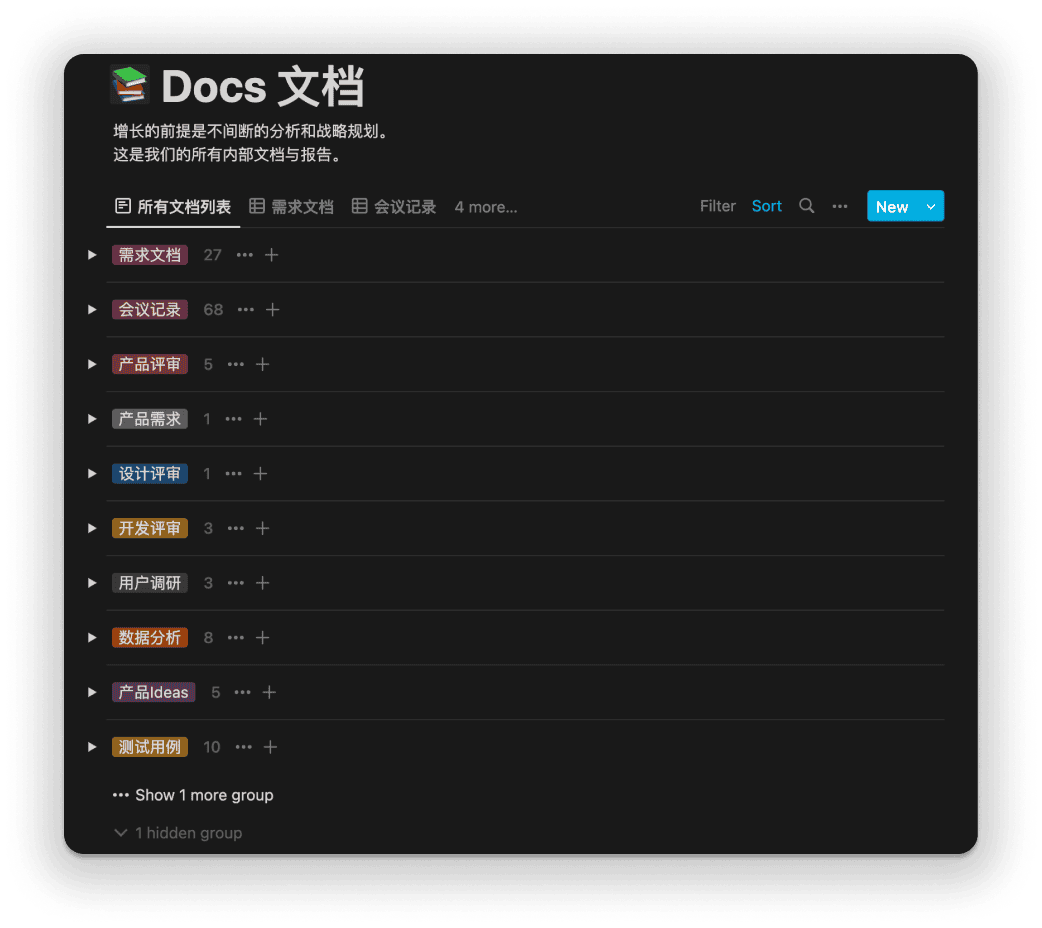
Exping’s design also challenges our team’s sense of taste. We strive to find the best way to manifest our concept in the product, ensuring it really comes through.
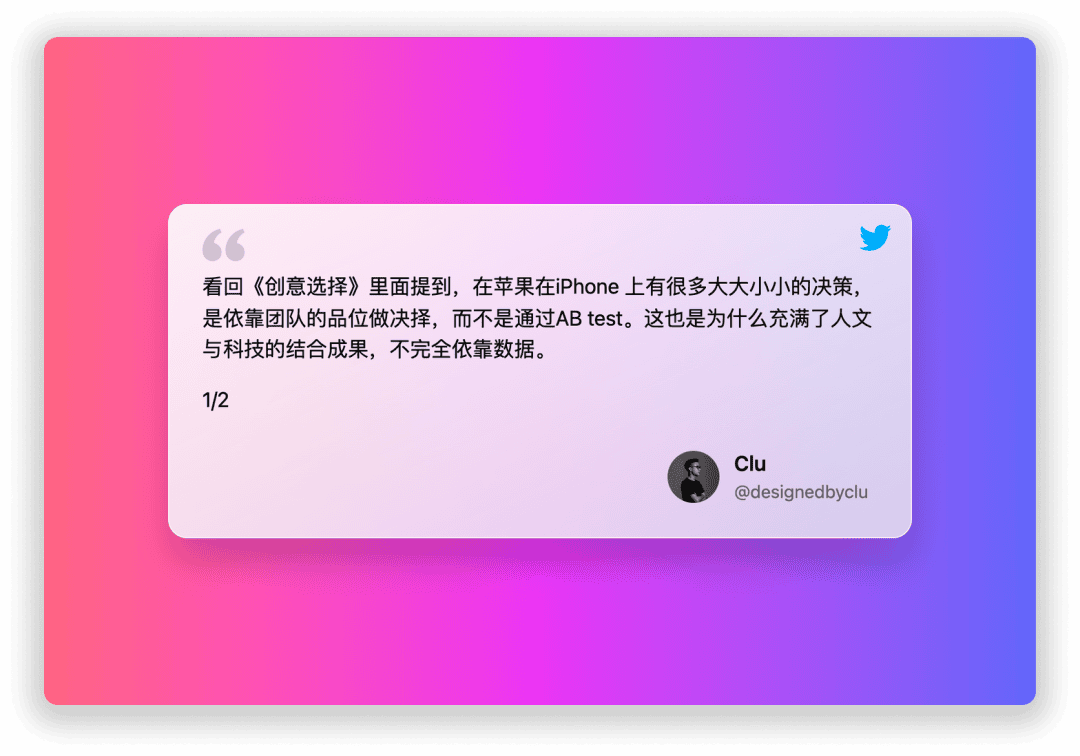
I was inspired a lot in Creative Selection: Inside Apple's Design Process During the Golden Age of Steve Job
Many of our decisions couldn't rely solely on data as the sole criterion.
Besides diving into extensive literature on human decision-making, our entire team also needed to align on our taste in product design.
From the Community to a Tool
In the latter half of 2021, we completed the development of our community prototype, version v0.1. This marked the first step from concept to product, and I particularly emphasized this version number because it fell short of what I envisioned for a "v1" stage. We invited around 100 beta users to experience and test.
During development, the world underwent significant changes. We witnessed the emergence of Delta and the quiet arrival of Omicron. Overseas users were unable to travel, with several Southeast Asian regions under lockdown. Our initial plans to launch exping internationally had to be temporarily shelved. Perhaps we could start locally, launch a cold start in our city. This decision also meant some user interface adjustments were needed when rolling out domestically.
Before our soft launch, we established a WeChat official account and interviewed interesting and idealistic local shop owners in Guangzhou. Our goal was to connect these unique stores with people who appreciate them. We believed that customers who love these stores share certain similarities in their tastes, facilitating mutual discovery. We named this column "EXPert Interviews."
By 2022, I realized that tackling the challenges and resource demands of a community-based platform in China was beyond the capabilities of our small team.
Therefore, in Q1, I made the decision to change the product direction, setting aside the concept of a Taste Community. Instead, we refocused on our original mission: help users to express on maps and ensuring that map content is meaningful and valuable.
Maps as a Unique Content Creation Form
While developing exping, we noticed that more and more people are trying to become content creators. Whether it's to fight against platform biases or to grow their own following, this trend is on the rise.
At the same time, tools in China that help content creators distribute, create, and monetize their work are also rapidly evolving (such as the recent resurgence of newsletters). A small but significant group of people are now willing to pay for content from creators they choose and trust, which is a positive sign. This kind of transaction is healthy for both creators and their audiences.
Everyone is a Curator

In the past, online content was primarily produced by platforms (PGC) and has since evolved into user-generated content (UGC). Platforms now push this content to consumers. With the flood of information available, recommendation algorithms have become essential to filter content for users. This led to the emergence of Curators, who act as intermediaries, filtering and sometimes editing content before sharing it with their followers.
exping was built with the idea of using "maps" as a canvas for content creation. We call our creators Curators, who use their personal taste to select and organize locations under specific themes on a map.
- Curate: Select and mark locations
- Curation: The completed map
- Curated: The selected locations
Everyone can be a Curator. On different platforms, we Curate (collect) various things. These collections can ultimately be presented as a Curation, organized with your insights and descriptions, showcasing what you care about and love.
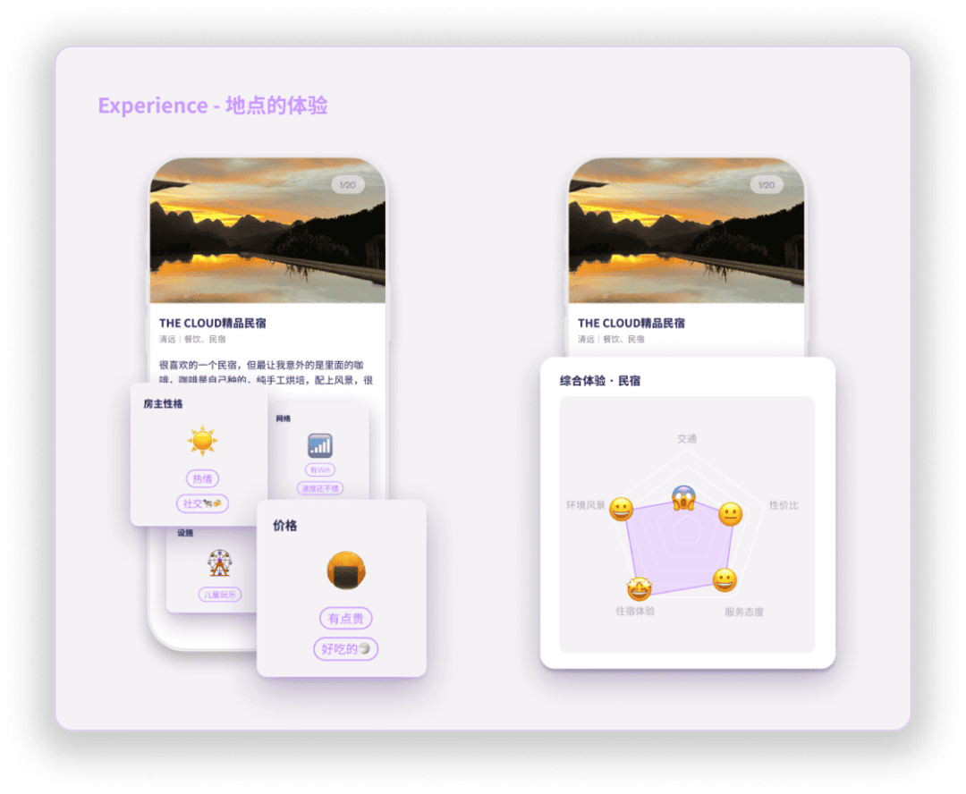
Maps on exping are curated with clear themes, where Curators select and aggregate locations under specific topics. They can describe, review, and rate these locations.
For example, maps like "Coffee Spots for Remote Working," "Flash City Trips," "Barbershop Avoidance Guide," "Designer Retreats," and "Architect's Travel Map" were created in exping.
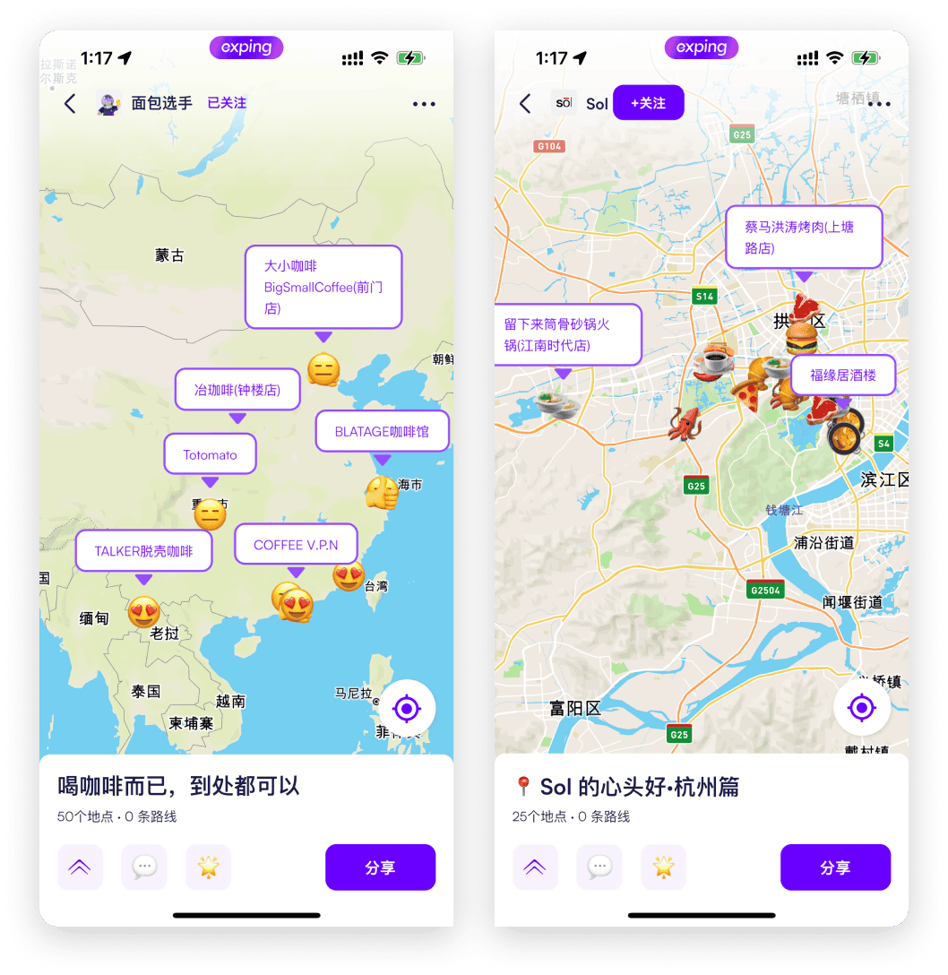
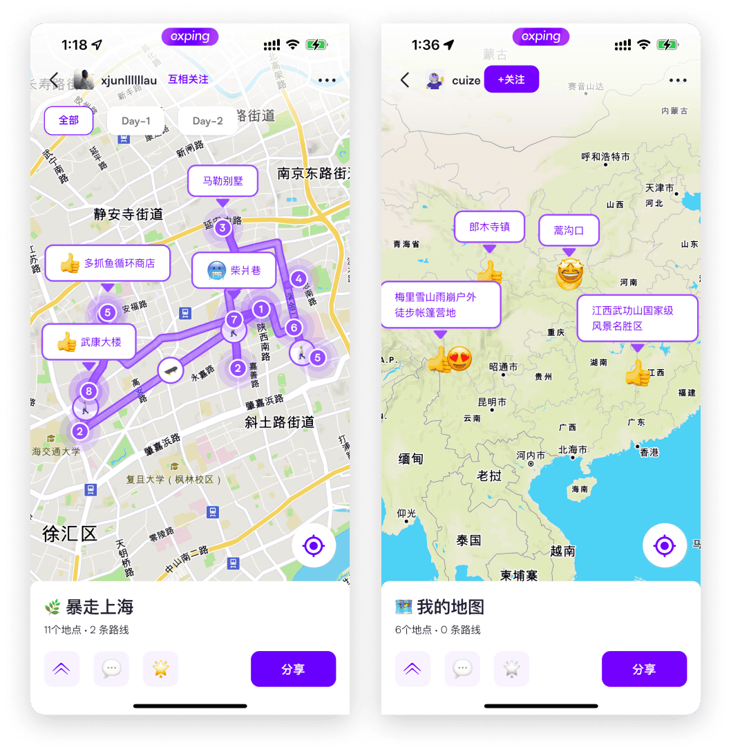
Building on this foundation, we've shifted from creating a Taste Community to serving Curators better in presenting map content.
We don't want Curators' content to be confined to exping alone but to help them showcase map-related content on other platforms they manage.
Official Launch
Time to get straight to the point. What is exping ultimately? It's a map-marking tool that allows you to showcase various themed maps such as local outings , travel, and outdoor adventures more effectively.
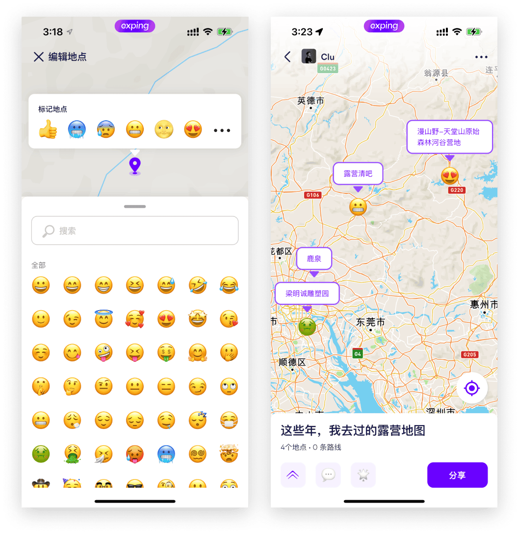
Location Marking:A marker does more than just pinpoint; Curators can use emojis to highlight impressions on the map.
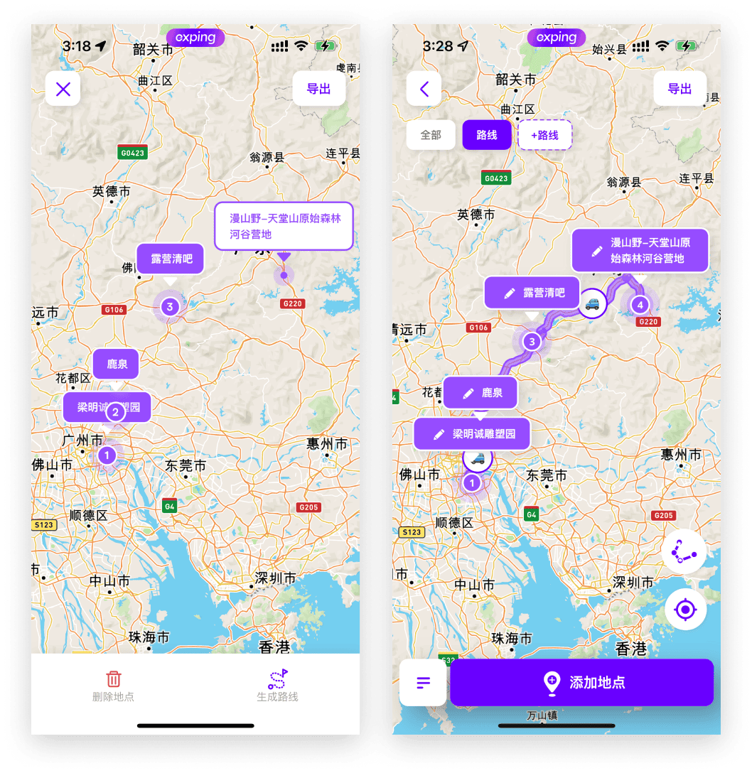
Route Marking: On a single map, not only can you mark locations, but you can also connect multiple points within the map with routes.
Custom Tags:We provide different options based on location categories. You can also create your own tags.
For instance, on an exhibition map, tags could serve as informative cards displaying details like exhibition times, ticket prices, and highlights.
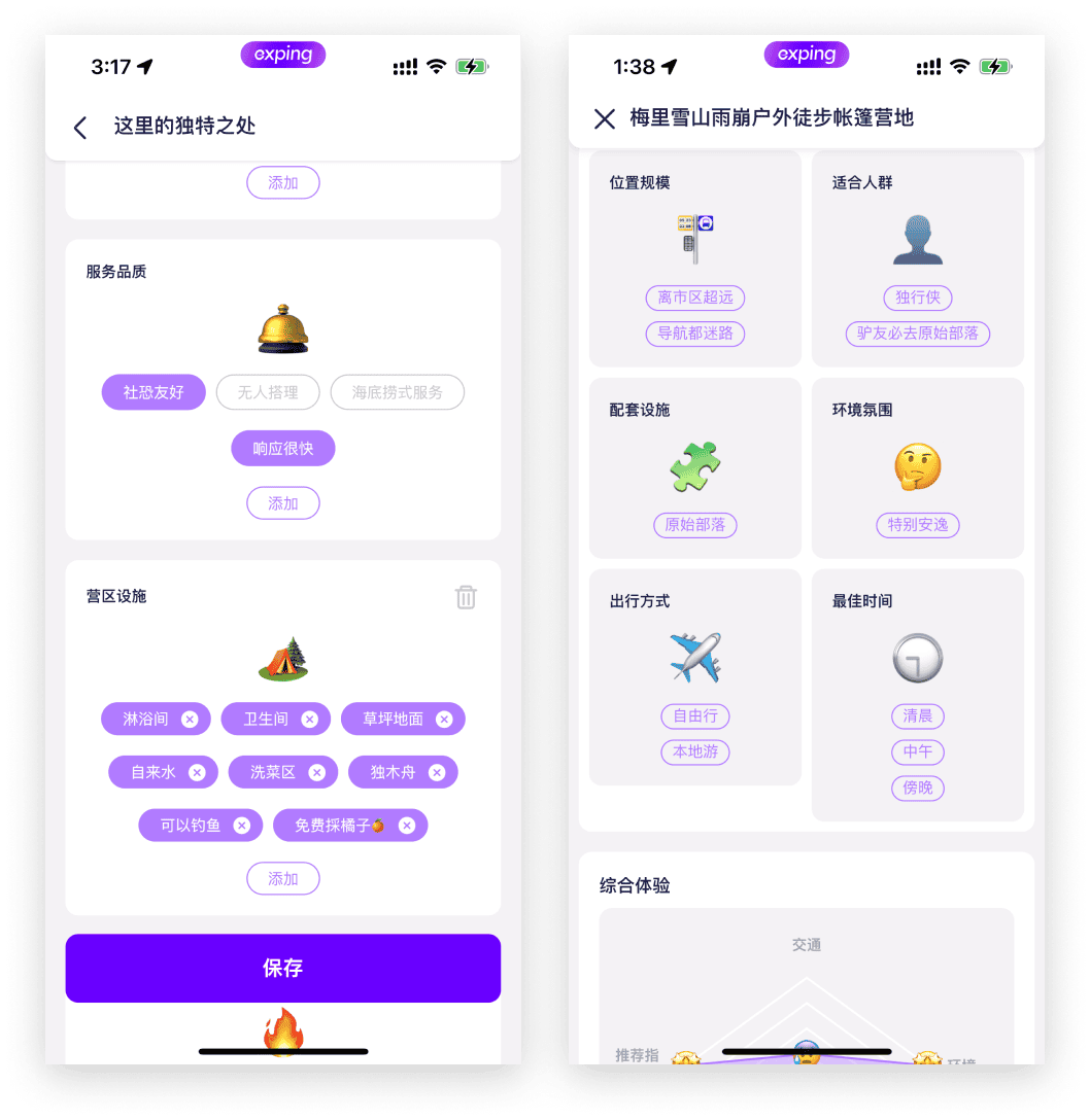
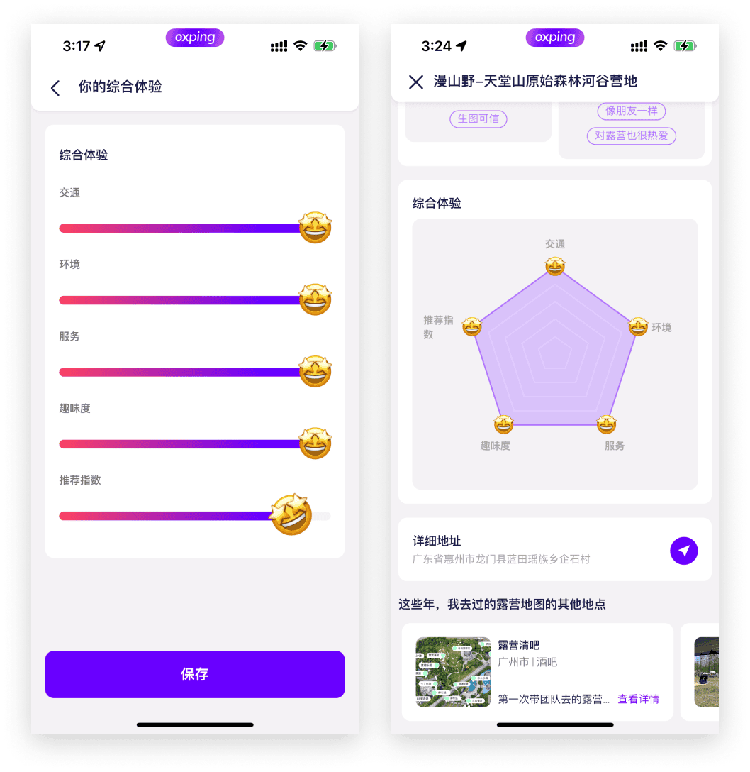
Visualized Ratings:Not all places can be accurately rated on a simple 1-5 scale. Our idea is to visualize ratings through radar charts, highlighting specific aspects that impact the overall experience.
This helps users see a comprehensive view, acknowledging areas that might have challenges like accessibility but excel in other experiences.
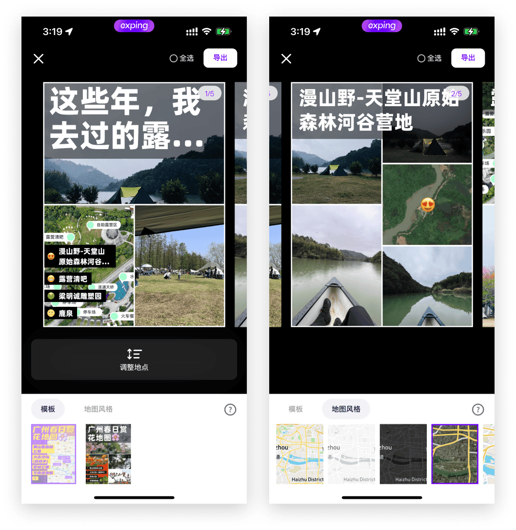
Generate Posters: Easily export posters featuring tags, descriptions, images, and reviews of locations or routes. Whether sharing on social media or with friends, this feature simplifies the process.
View in Web: Share map content easily via web links without requiring app downloads or registrations, catering to those interested in a quick browse.
Finally, our original "Taste Community" remains, where like-minded individuals can connect and explore shared interests.
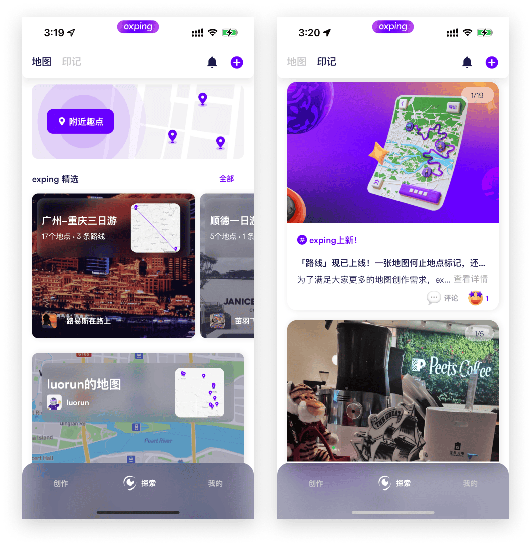
Since launching, we've seen diverse uses for exping:
- Real estate agents marking properties with details like size and rental prices.
- Restaurant chains enhancing location information and sharing across their networks.
- Charities highlighting monthly charity events.
- Couples recording their love stories by marking places they've been together.
- Parents keeping track of their children's growth like a journal on the map
……
The various user stories make us especially happy to see that we've succeeded in making every map more valuable.
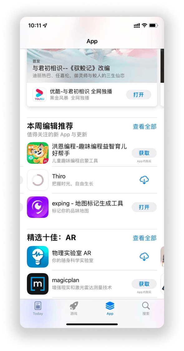
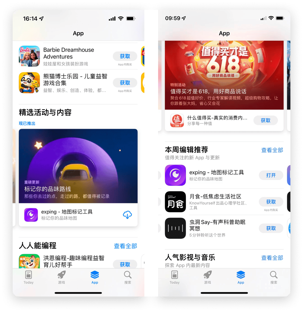
More importantly, we're delighted to have been featured by Apple in their weekly Editor's Choice during our launch week, a testament to our recognition and success.
Recently, our launch of major updates was also featured on the Apple homepage. Additionally, we were once again selected as an Apple Editor's Choice, bringing us immense motivation.
Clean up Our Own Mess
After the official launch, we received a lot of feedback. Why is it so laggy? Why doesn't it support high refresh rates? Most of these issues stem from our use of the Flutter framework, which allows a small team of 2.5 people (including myself as the 0.5 people, who contributed bugs and handled the multilingual aspect) to efficiently develop for both platforms simultaneously.
Even though iOS users made up the majority, various issues (like Schrödinger's bugs that we couldn't reproduce) affected the user experience. However, our initial research indicated that potential users who needed map creation were also on Android.
So, we continued working hard to address these issues.
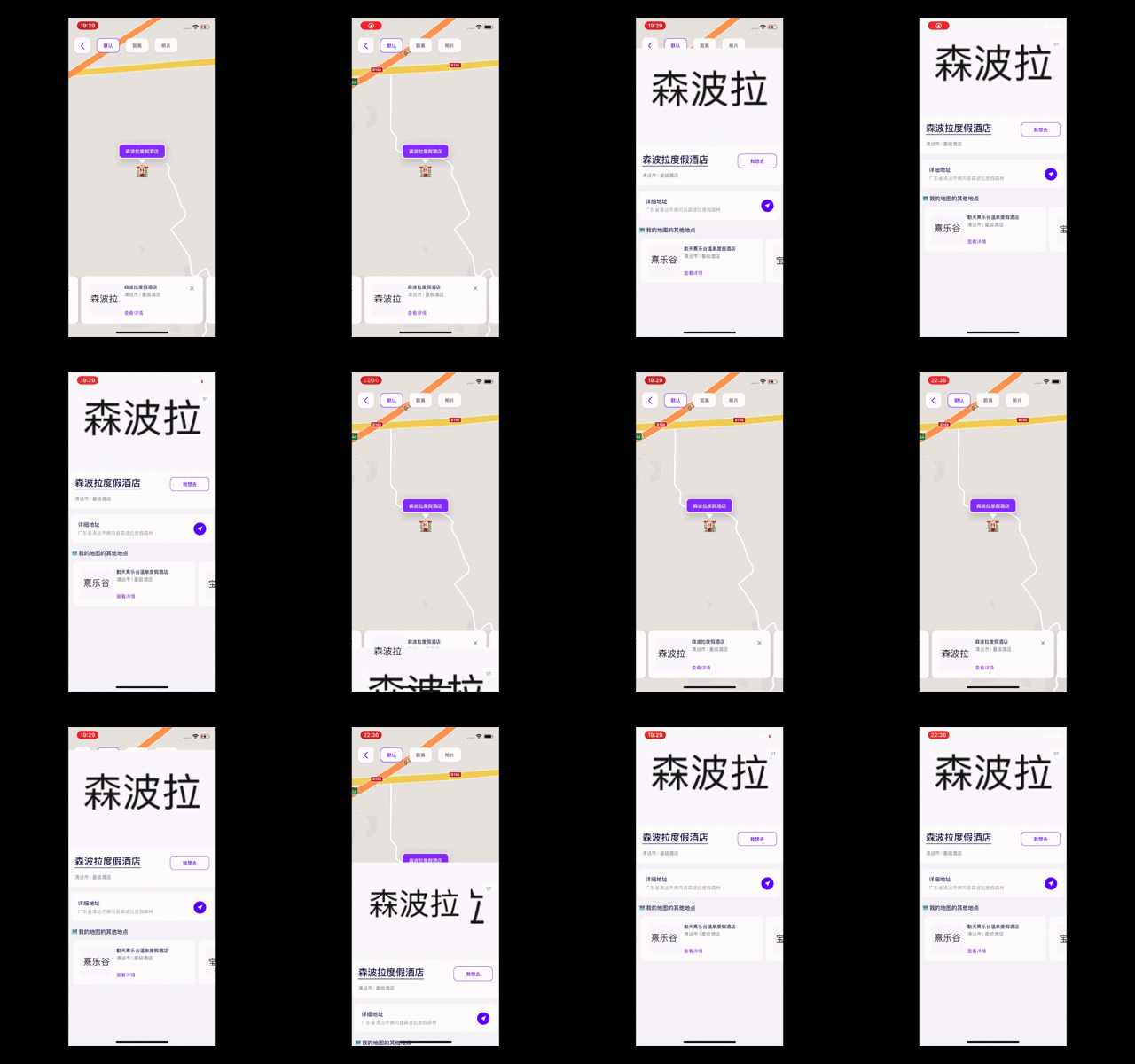
Flutter's single-threaded Dart processing can cause performance issues in complex interactions, compared to developing purely with SwiftUI.
For example, our use of an open-source image picker couldn't meet our performance needs and the interactive experience we envisioned (even with limited time and resources, none of us wanted to compromise). So, we built our own picker from scratch and contributed it back to the open-source community.The open-source community has been a huge help to us, solving many of our problems.
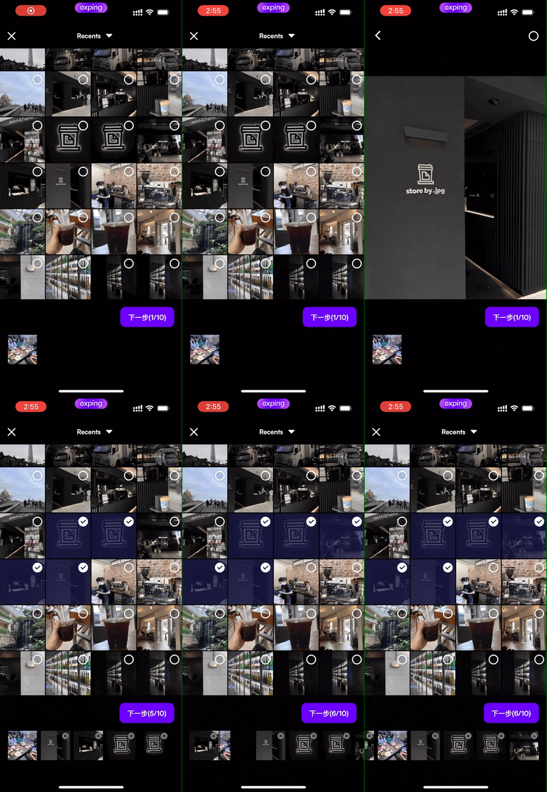
These shortcomings might stem from our limited understanding of Flutter. However, we prioritized fixing performance and lag issues in the second version after the initial release.
Our full-stack engineer (our backbone) wrote an article Flutter Optimization: The Journey of Developing exping - exping to review and share our solutions.
Initially, we used Flutter for Web for our web version, but many components didn’t function as smoothly as the core library, and even rendering plain text could be problematic. Ultimately, we had to abandon it midway and rewrite it using a different web technology stack.
Future Plans
At exping, our next steps will continue to focus on enhancing features for map creators and improving the map browsing experience.
While many friends hope we'll keep building the community, we care deeply about its value. We don't want it to just be a platform for sharing photos but a tool that allows anyone to customize their maps with flexible expression. With limited resources, we’ll first concentrate on refining the core features.
We have a long list of tasks, including:
- Enhancing international data
- Importing third-party map data
- Data export capabilities
- Data analytics
- Personal digital cards
- Embedded maps
- Improved sharing options (many users request mini-program support)
- Map monetization or subscription models
- Original content rights management
- And more...
How will we make money? By selling data?
All monetization models come down to transactions—with whom we transact. Merchants? Advertisers? These are not our primary considerations.
We aim to establish a healthier model.
We see exping as a tool for creators, providing them value.
In future versions, we’ll charge for value-added features. Users can either subscribe to access all features or pay for specific functionalities. If our tools help creators produce better content and earn revenue, we believe this is a sustainable and healthy model.
Data is also our top concern. As mentioned earlier, retaining creators' data solely on exping is not our goal. Users will have complete control over whether their maps are public or private.
From the outset, we’ve considered how to ensure data remains accessible, even if we can't continue operations. With the ongoing development of blockchain, we’re exploring ways to decentralize this data, making it accessible not only on exping but also in your other future Web3 applications.
Thank you all
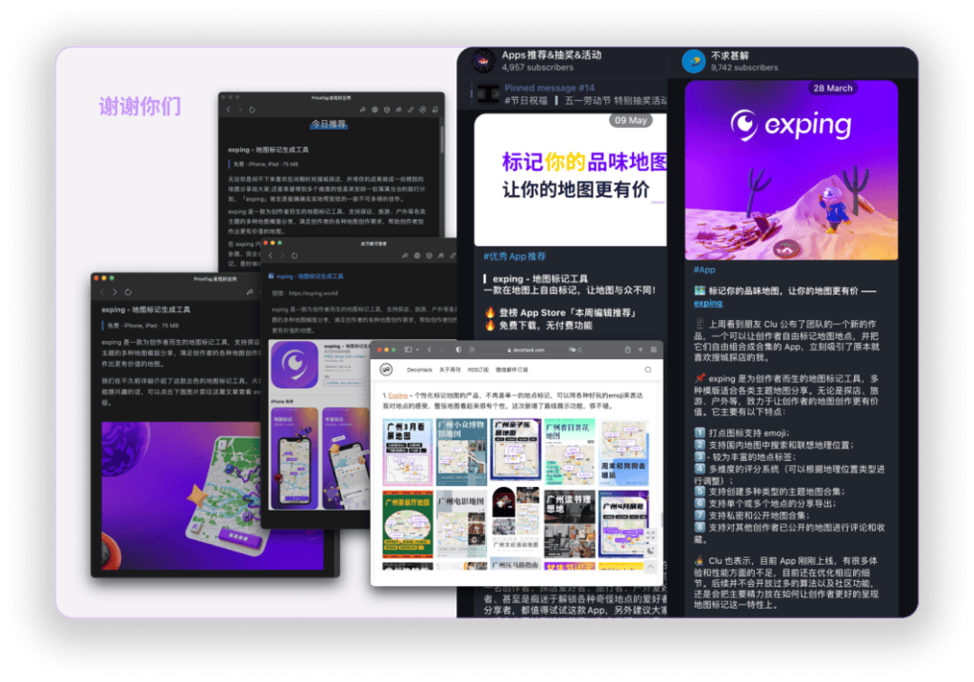
Since our launch, we've been operating without a dedicated marketing team and with limited promotional knowledge. Despite this, we've been fortunate to have many friends share our project and newsletter creators help spread the word after our launch. We are incredibly grateful for your support.
Last but Not Least
Thank you for taking the time to read this. I want to share an inspiring message that has kept me going.
When many people told me that no one downloads apps anymore, that this wouldn’t work, or that the market isn’t big enough, this is what kept us moving forward:

Speech We choose to the moon
We choose to go to the moon in this decade and do the other things, not because they are easy, but because they are hard, because that goal will serve to organize and measure the best of our energies and skills, because that challenge is one that we are willing to accept, one we are unwilling to postpone, and one which we intend to win, and the others, too.
Share